Final Results…


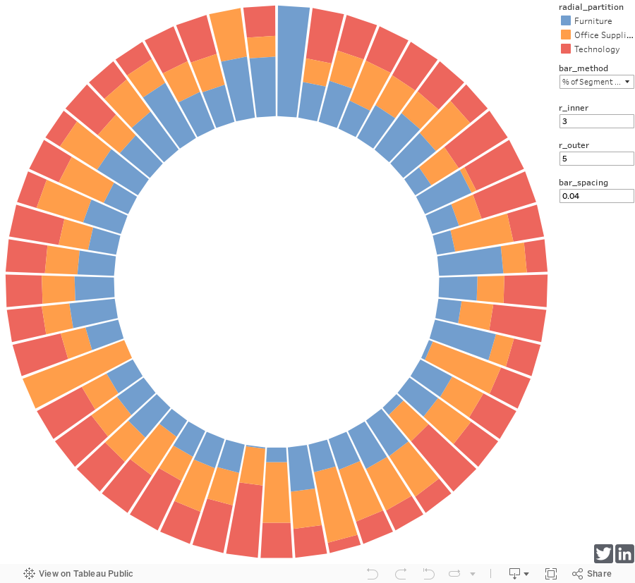
Once completed, you’ll have the option of displaying your bar chart as absolute values (bottom-right), or as a percent of each segment’s total (left).
The size of the bars, inner circle and gaps between each bar will be adjustable as you see fit per parameters we’ll create.
Click here to view the interactive version on Tableau Public.
Introduction…
Welcome all, to my first ever blog post!
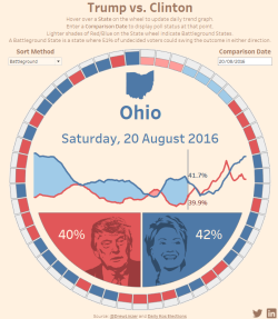
The past couple of weeks I’ve been taking part in a great Tableau community project called #MakeoverMonday. This week’s challenge was to create a visualisation based on the daily opinion polls for the US 2016 election, for which I submitted this (Click image to open interactive version).
Following my submission, I received several requests to make the workbook downloadable on Tableau Public and received a few questions about the functionality, so, I thought I’d do a write-up of how I created the wheel of stacked bar charts.
Now, anyone who downloaded my Trump vs Clinton dashboard will notice there’s actually a lot of fudges in there. First of all, the stacking of the bar charts isn’t dynamic, I pretty much manually told it to generate a top segment and a bottom segment and place them accordingly (ie it only works for 2 stacks) and I gave up trying to get bins to work on the path and fudged the SQL to compensate.
However, for the purposes of this blog post, I revised my method and will be walking you through a new (at least I believe so, I’ve never seen anything like it before) way to create truly dynamic stacked bar charts around a wheel.
Before I begin, I’d like to point out that while this method is my own and differs in output, I was influenced by both Bora Beran’s radial tree maps and Interwork’s radial lines.
Let’s get started…
This post is going to get long, not because I’m waffling. Rather than just tell you, do this, do that, I’m going to try and attempt to explain why we’re doing each step and what the purpose of each calculated field is, in an attempt to allow you to learn the process, rather than just blindly following instructions…. and maybe a bit of waffling. 😉
For this tutorial, I’ll be using the Superstore sample data, connect to the spreadsheet datasource provided by Tableau using a Legacy Connection (Click to enlarge):

Rather than connecting directly to a sheet in the workbook, we’ll be using a custom SQL query as follows:
select 1 as [PathOrder], *
from [Orders$]
UNION ALL
select 5 as [PathOrder], *
from [Orders$]
All this does, is duplicate the data set so there are 2 entries for every row, one with a path reference of 1 and the other with a path reference of 5 – we’ll get to why later.
Now we can get to work creating the drivers – First of all, I harbor a hatred for magic numbers, so we’re going to begin by creating a few parameters that will later drive a few cosmetic details on our radial stacked bar chart.
Parameters…
Create the 4 following parameters (note you may want to give them better names as I know my naming convention isn’t the best).
bar_method (boolean) – This parameter will drive whether our chart displays the partitions as absolute values or as a % of the segment total. I set the alias on true to “Absolute Values” and the alias on false to “% of Segment Total”.
bar_spacing (float) – This one will determine the amount of white space between each of our bars (my value = 0.04).
r_inner (float) – Determines the inner radius of our circle – ie the amount of white space in the middle of the circle (my value = 3).
r_outer (float) – Determines the outer radius of our circle – ie how long our longest bar will be in relation to r_inner (my value = 5).
With that done, we can begin creating our calculated fields, of which there are several. Some of the calculated fields can be skipped, I’ve created them to allow me to change drivers (segments, partitions, summary value etc) easily without having to fix the definitions for my table calcs.
Calculations…
These first 2 calculated fields are the fields you could skip creating if you’re not interested in being able to easily change the segment or partitioning method of your chart.
radial_segment (dimension) – This field will determine our bar separation, eg in my example I’ve used [State], meaning I’ll get a bar for each individual state in the data.
[State]
radial_partition (dimension) – This field will determine how each bar is partitioned for stacking, eg in my example I’ve used [Category], meaning I’ll get a bar stack for each category in the data.
[Category]
The remaining calculated fields are mandatory and should be created in order.
index_pathorder (measure) – This field will be used to allow our table calcs to perform calculations on rows that don’t exist in our data (we’re going to mimic them later with a bin).
index()
index_segment (measure) – This field will be used to determine how many bars we need to draw and from that determine the correct angles for each bar.
index()
value_field (measure) – This field will determine which value gets summarised, we force it to equal 0 on rows where we set PathOrder to 1 (in the custom SQL) as we don’t want to double count – Change [Sales] to any other measure you’d like to base your bars on.
if [PathOrder] = 1 then 0 else [Sales] end
value_partition (measure) – Simply sums up our value field at the deepest level required (state>category) and inserts the value on every row in the data (including fake rows in our bin).
window_sum(sum([value_field]))
value_segment (measure) – As above, but sums up our value field at the segment (State) level rather than the partition (State>Category) level.
WINDOW_SUM(sum([value_field]))
value_segment_max (measure) – This field determines the maximum value_segment in the view – which will be used for generating our Absolute Values view of the data.
WINDOW_MAX([value_segment])
value_limit (measure) – This field will be used to set where each bar should end, either in relation to value_segment for % of segment view or value_segment_max for the absolute values view – based on the selection in our bar_method parameter.
case [bar_method]
when true then [value_segment_max]
else [value_segment]
end
Intermission – BINS…
I was going to leave our bin until last, but the remaining calculated fields are easier to explain once I’ve explained what the bin is.
Basically what we’re going to do is create some fake rows in our data set based on the PathOrder field we created in our custom SQL.
We’re going to do this because when we come to create our chart we’re going to do so using the Polygon mark, which allows us to draw shapes based on co-ordinates of points we define (AKA a path). We want to be able to draw squares (ok, technically they’re trapeziums as only the top and bottom edges are parallel 🙂 a single partition is one trapezium), to draw a square we need 5 points: Bottom-Left (1), Top-Left (2), Top-Right (3), Bottom-Right (4) and join back up at Bottom-Left (5).
The PathOrder field we created is going to be our point order, but the problem is we only have 2 entries in our dataset, 1 and 5. We can create the missing points using a bin, so let’s do that!
Right-click the [PathOrder] field in the dimension window.
Goto Create > Bin.
Setup per image below and click ok.

Voila! As easy as that! This new field will allow us to make reference to points 2, 3 and 4 in our table calculations below.
Calculations Continued…
partition_size (measure) – Right here is where the magic starts to happen, this field will determine the height of each partition in our chart – we set points 2 and 3 (Top-Left and Top-Right) to be the running sum of all partitions in the segment divided by the value limit we set earlier (segment sum or max segment sum). Points 1, 4 and 5 (Bottom-Left, Bottom-Right and Bottom-Left again) are calculated in the same way except we deduct the sum of the current partition from the running sum (ie the bottom points of the partition will be the same as the top points of our previous partition – stacking).
IF([index_pathorder]=2 or [index_pathorder]=3)
THEN RUNNING_SUM([value_partition])/[value_limit]
else (RUNNING_SUM([value_partition])-[value_partition]) / [value_limit]
end
radial_length (measure) – We have our partition size, but we need to generate the co-ordinates of each of our points, taking into consideration our r_inner and r_outer parameters. This field determines, for each point, the distance from the center of the circle.
[r_inner] +
([partition_size]* ([r_outer]-[r_inner]))
radial_angle (measure) – We also need to determine the angle at which our points should sit in relation to our circle we do this based on the index of the current segment in relation to the total number of segments we need to draw. For points 3 and 4 (Top-Right and Bottom-Right) we’re going to calculate the angle based on the next segment less our spacing adjustment, for all other points we calculate based on the current segment plus our spacing adjustment.
IF([index_pathorder]=3 or [index_pathorder]=4)
THEN
[index_segment] +1 – [bar_spacing]
else
[index_segment] + [bar_spacing]
end
* (1/window_max([index_segment])) * 2 * 3.14159265359 + (3.14159265359/2)
Now we have our radial_length and our radial_angle, all that’s left to do is calculate our x and y co-ordinates using some basic trigonometry.
plot_x (measure)
[radial_length] * COS([radial_angle])
plot_y (measure)
[radial_length] * SIN([radial_angle])
That concludes the calculated fields, now we just need to tell Tableau to draw us a circle…
Creating the Chart…
The first step in creating the chart is dragging all of the relevant fields on the the correct cards.
So first off bring your plot_x field on to the columns card, your plot_y field on to the rows card and finally your radial_segment, radial_partition and PathOrder (bin) fields on to the marks card.
Now, on the marks card, set your mark type to Polygon and drag the PathOrder (bin) field on to the Path icon. You may also want to put radial_partition on the colour card so you can easily identify your individual partitions.
All we have left to do now is set the calculation criteria for all of our table calcs.
Begin by right clicking the plot_x field on the columns card and selecting Edit Table Calculation. Apply the following settings to each Nested Calculation.
partition_size
- Compute Using: Specific Dimensions (radial_segment & radial_partition)
- At the level: Deepest
- Restarting every: radial_segment
index_pathorder
- Compute Using: Specific Dimensions (PathOrder (bin))
value_partition
- Compute Using: Specific Dimensions (PathOrder (bin))
value_segment_max
- Compute Using: Specific Dimensions (PathOrder (bin), radial_partition & radial_segment)
- At the level: Deepest
- Restarting every: None
value_segment
- Compute Using: Specific Dimensions (radial_partition & PathOrder (bin))
- At the level: Deepest
- Restarting every: None
radial_angle
- Compute Using: Specific Dimensions (PathOrder (bin), radial_partition & radial_segment)
- At the level: Deepest
- Restarting every: None
index_segment
- Compute Using: Specific Dimensions (radial_segment, radial_partition & PathOrder (bin))
- At the level: radial_segment
- Restarting every: None
You should now be looking at a radial stacked bar chart! If you’re not, try applying the same settings to the nested calculations in the plot_y field.
You can now play around with the various parameter fields we created to control the size and spacing of your circle/bars. Add items to the tooltips and play around with the colours as you would any other Tableau chart.
If you’re having any troubles you can download a working example workbook on my Tableau Public profile.
I hope you enjoyed the post, please feel free to share with your network and leave comments/ask questions below.
Until next time….
Ryan.
Follow @rkrowland87
Hi Ryan. Amazing work. I am so psyched I immediately started replicating this. However, mine doesn’t look exactly the same. I following the instructions to the dot except during the Nested Calculations: under partition_size, Restarting every: I do not see radial_segment. I only see radial_partition. Can you help with this please?
LikeLike
Hi Suraj,
Sorry Suraj, I should’ve made the instructions a bit clearer. When you click to use specific dimensions and put check boxes in the relevant dimensions, you also need to reorder the dimensions by dragging and dropping them. They should be in the same order I listed in the guide. Hope that helps. Ryan.
LikeLike
Hey Ryan,
No complaints. I think you have done a tremendous job not only with the chart but also with the blog. I am sure it took some work to explain all the details. I was able to successfully replicate it. Thanks for sharing!
Suraj.
LikeLiked by 1 person
Reblogged this on DIGR.
LikeLiked by 1 person
Hi Ryan
This is very amazing chart !! The steps you have given I have followed step by step till the end.
But i did not see any graph computed, it is showing a blank grid layout sheet.
Help me out in this.
Thanks
LikeLike
Hi Ryan,
This is very amazing chart ! I have followed step by step till the end but not able to see the same chart as it is showing blank sheet.
Any suggestion.
Thanks
Rohan
LikeLike
Same here. I have tried doing this several times, but it gives me a blank quadrant…
Could anyone please help?
LikeLike
can you tell me the advantages of radial stacked bar graph
LikeLike
It looks cool and is a bit of a space saver in comparison to a standard bar chart. Other than that there are no advantages over a standard stacked bar chart.
In all honesty, I wouldn’t use this chart in a workplace setting – I created it for a personal project and to see if I could. 🙂
LikeLike
cc
LikeLike
can you tell me some similar graphs
LikeLike
hello Ryan
how to draw radial circles for this graph in tableau
LikeLike
Ryan,
BeYoutiful work and thank you for the how to…worked the first time. Fritz
LikeLike
Hi Ryan,
I was trying to create the same as you have done, but when i put Plot_X in Columns there i got some problems.
1) In partition_size i am able to select radial_segment and radial_partition.
2) However, I dont get the option of radial_segment in Option “Restarting every” in the dropdown.
Can you please let me know why i am not getting that option in the Dropdown?
Awaiting for your feedback.
Regards,
Tausif.
LikeLike
Hi Tausif,
You should make sure your fields are in the correct order in the table calc UI.
Regards,
Ryan.
LikeLike
Thank you for your explanation. I am able to re-create the chart with different dataset. The explanations are really, really helpful.
LikeLike
Hello Ryan
Amazing job
I replicated this with my set of data, weekly data for 2017 and 2018(progress) comparing each week side by side.
the only concern we have is how can I display the labels like the %/value on the stacked bar & also I want to have the week no in the inner circle? as end user pdf it
LikeLike
Hi Satish,
Labels are a limitation of using the polygon method of designing custom chart types. That’s not to say it’s not possible, but it’s a bit fudgy and usually doesn’t work that great.
Regards,
Ryan.
LikeLike
When I try to Edit Table Calculations for plot_x and try to set “Restarting every” to radial_segment, it does not show up as an option, only radial_partition does. Have you run into this problem before?
LikeLike
Hi Grace, you should make sure your fields are in the correct order in the table calc window. Regards,
Ryan.
LikeLike
Hi Rayan
I want to know if the same logic applies to the other data sets which are large.
And also I wasn’t able to do the custom SQL query for path order, but I did create the path order by creating a union on the same data set and using the below calculation in the calculated field :
IIF([Table Name] = ‘my dataset.csv’, 1,5)
And after this I created the bins, I am not able to get the radial stacked bar chart instead I’m getting a pentagon kind of structure.
Please help.
LikeLike
Be sure to download Ryan’s workbook from Tableau Public! If your radial chart isn’t showing up, look at the plot_x and plot_y table calculations and ensure it matches yours. They might differ slightly from the text provided above^
Nevertheless though, very easy to understand tutorial!!! Successfully able to replicate on Tableau 2020.2.
Here’s some updates for data prep for newer versions of Tableau- Replace the custom SQL by:
1. Union the orders table together (or any data source).. just union the same source with itself
2. A new “Table Names” column will be created…. ex: Source & Source1
3. Create a calculated field “PathOrder”:
IF CONTAINS([Table Name] ,”1″) THEN 1
ELSE 5
END
4. Follow Ryan’s instructions and reference his Tableau Public workbook if there’s any confusion and voila!!! It will work 🙂
Thanks Ryan!
LikeLike
Hi Rayan! Amazing work — it works like a charm! Quick question:
Let’s say my radial segments are months or weeks — is there any way to ‘fix’ it so that the first month (or week) always starts at the top and goes clockwise?
Thanks again!
LikeLike
I’m pretty sure that’s the way it works with the math I provided but I don’t have Tableau installed to verify. Either way, you can manipulate starting position and direction by playing around with the maths in the radial_angle calculated field.
LikeLike